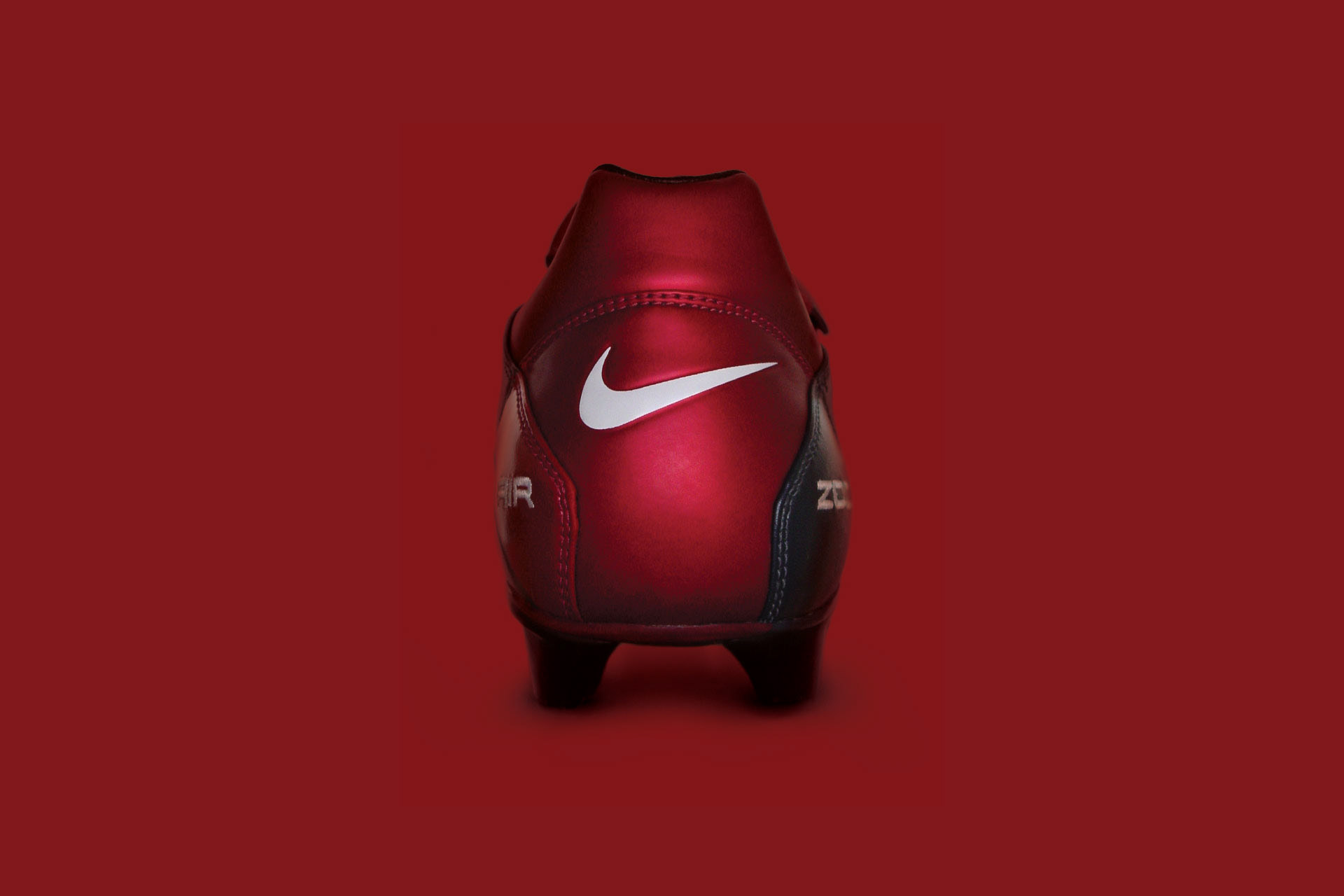
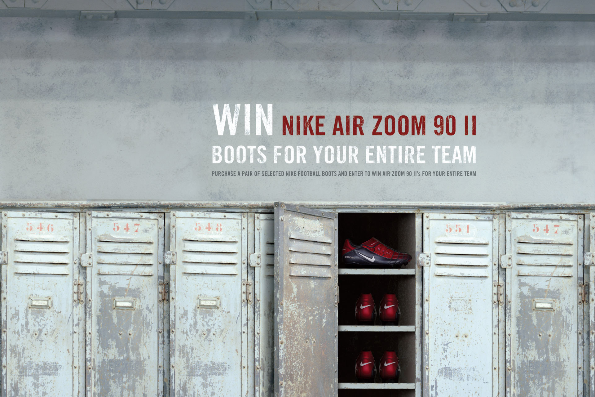
Nike — Air Zoom 90 Campaign:
The objective was to encourage team members to purchase the new Air Zoom 90's with the incentive that they could win boots for there entire team. The campaign was also to enforce Nike as a leader in boot technology and performance. The solution shows an environment that is real to the consumer, it is set in a typical rough-and-ready changing shed that you would see anywhere in the country on a Saturday morning. Amongst this grass roots backdrop the Air Zoom 90 is pulled forward as the hero to illustrate what a teammate could win for their team.
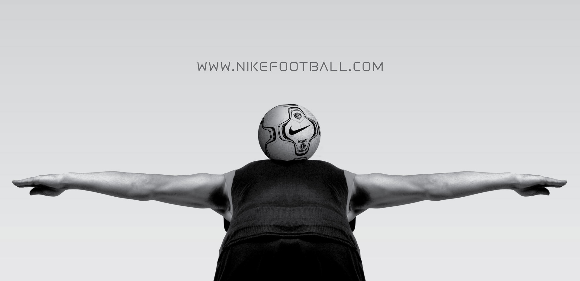
Nike — Soccer New Zealand:
The objective was to create imagery that expressed strongly Nikes' personality and involvement with soccer in New Zealand while pulling forward the brand. The concept was to highlight the swoosh (logomark) on the ball that has been flicked over the head and balanced on the shoulder blades of a player during a practice drill session.

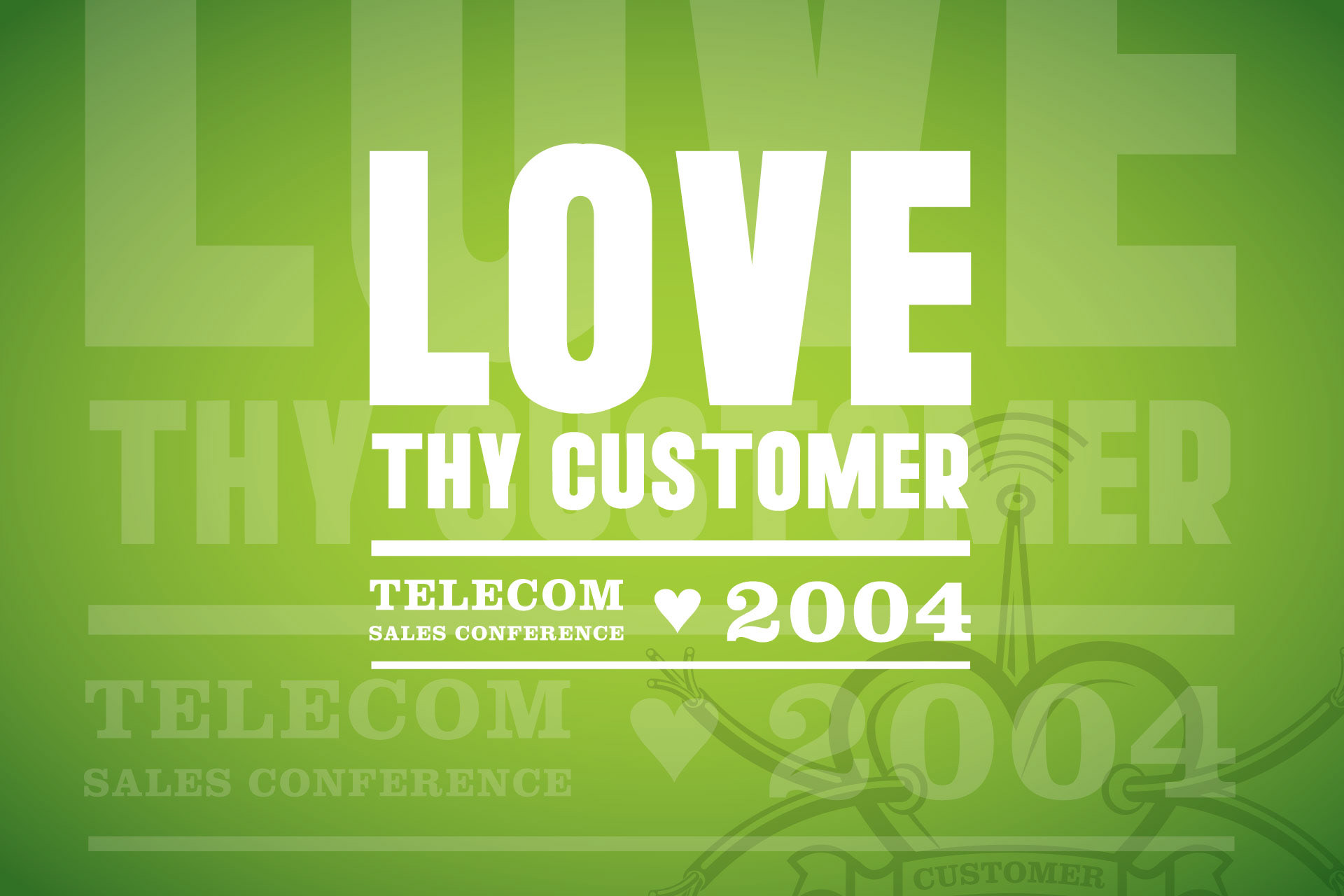
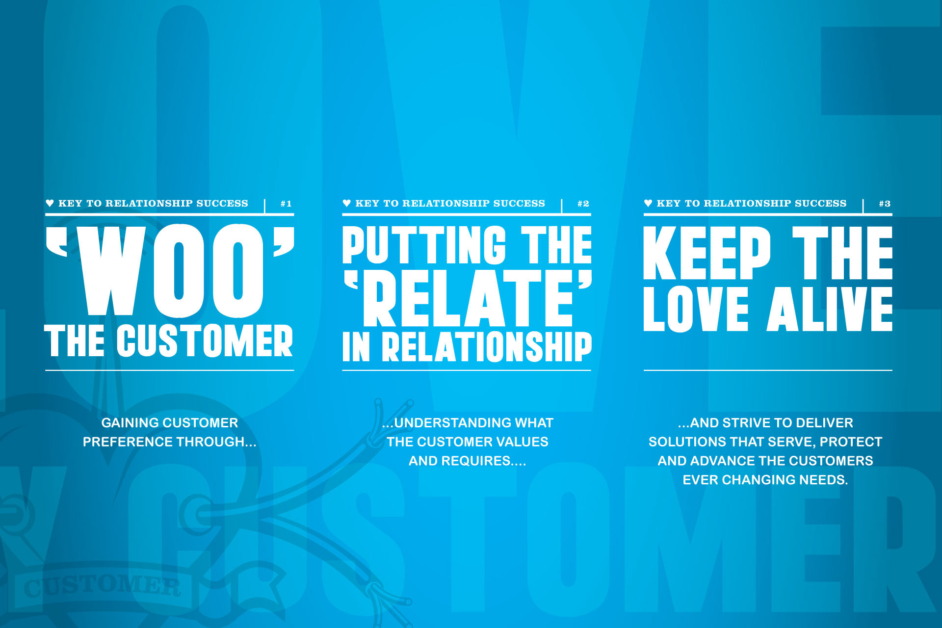
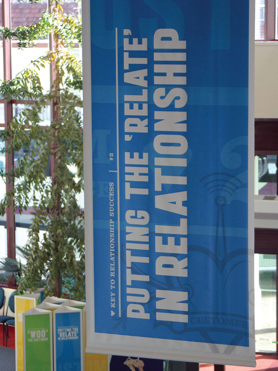
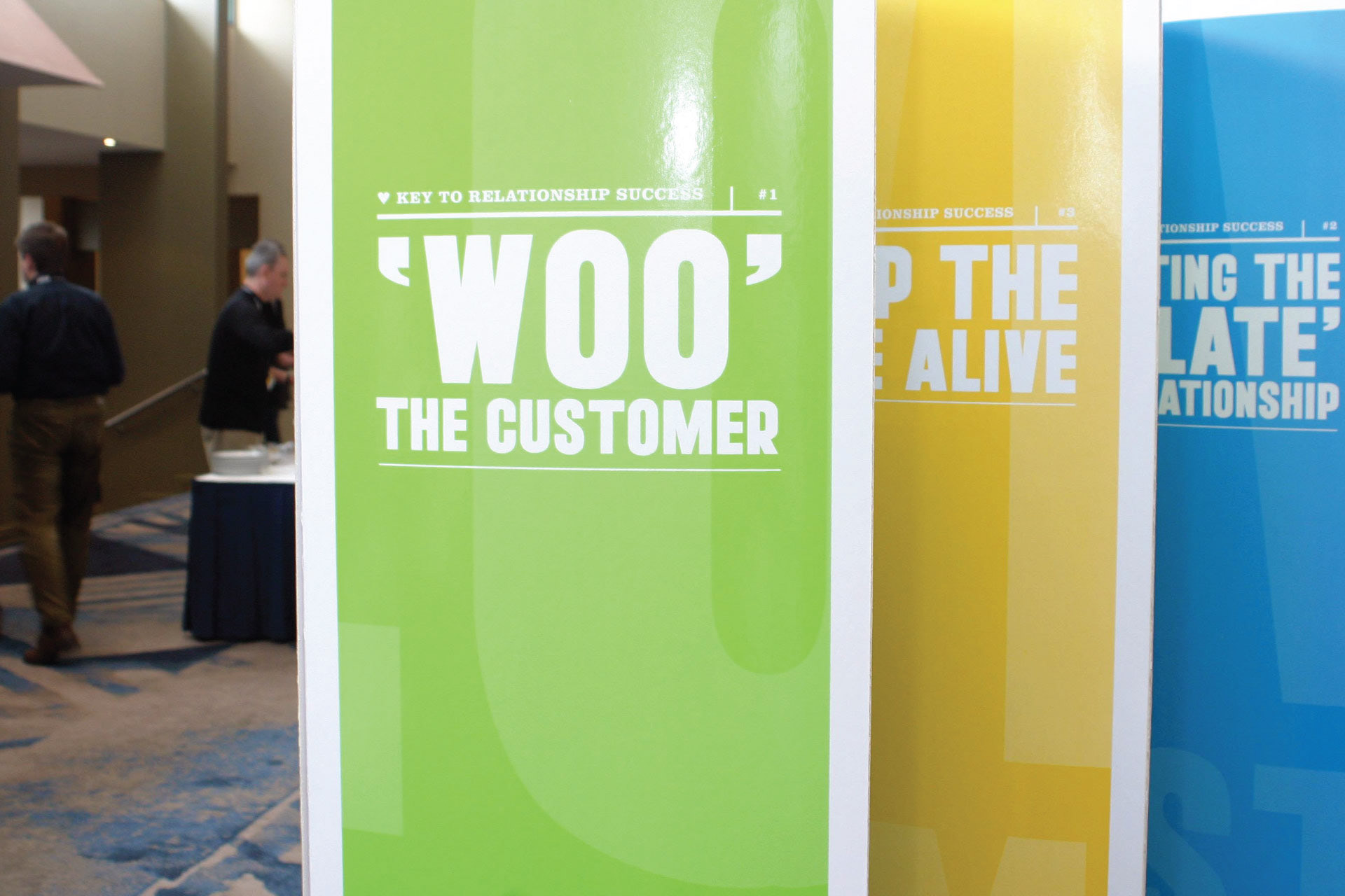
Telecom — Sales Conference:
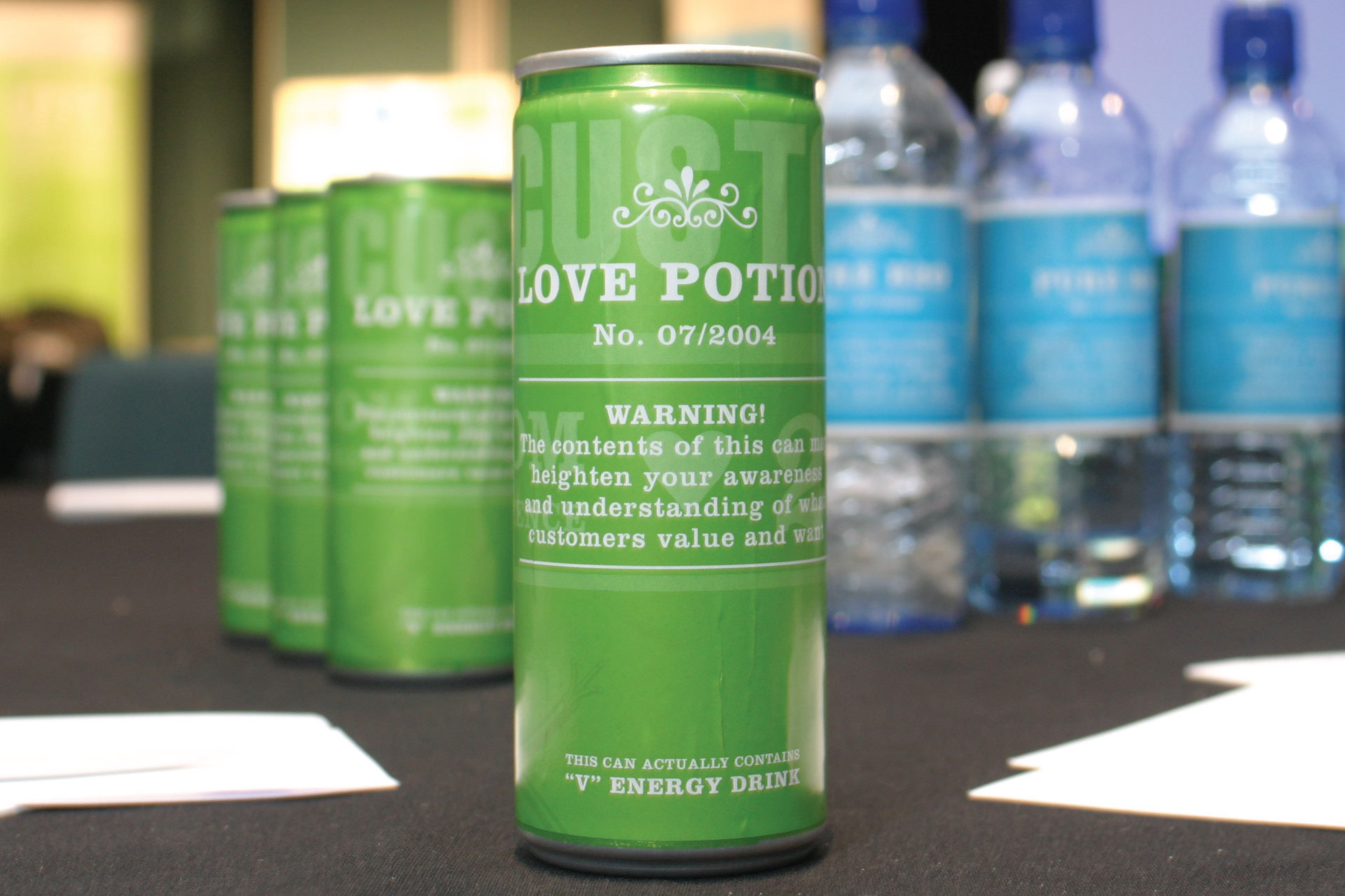
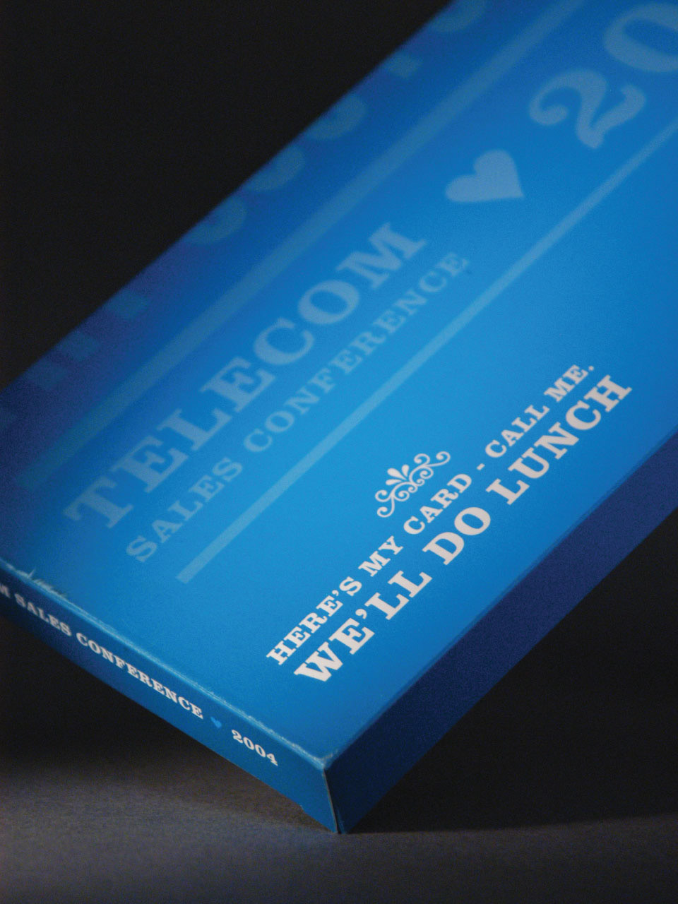
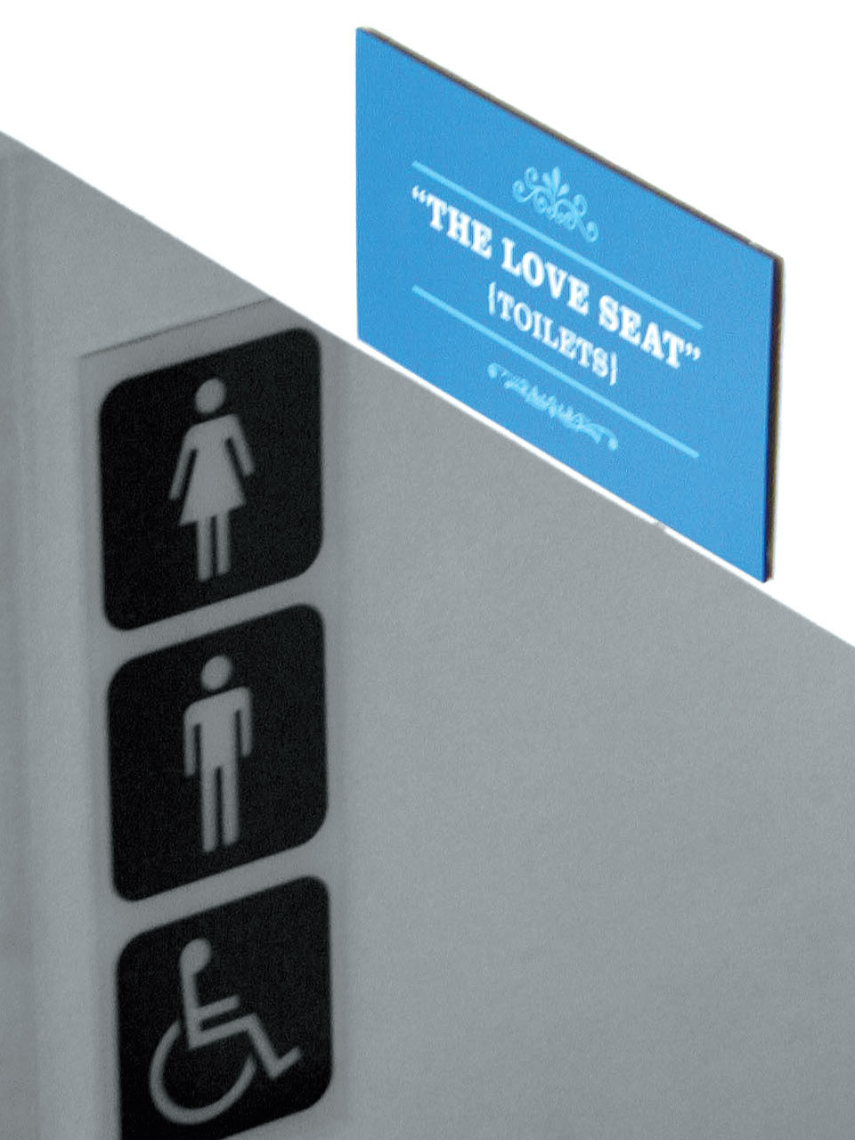
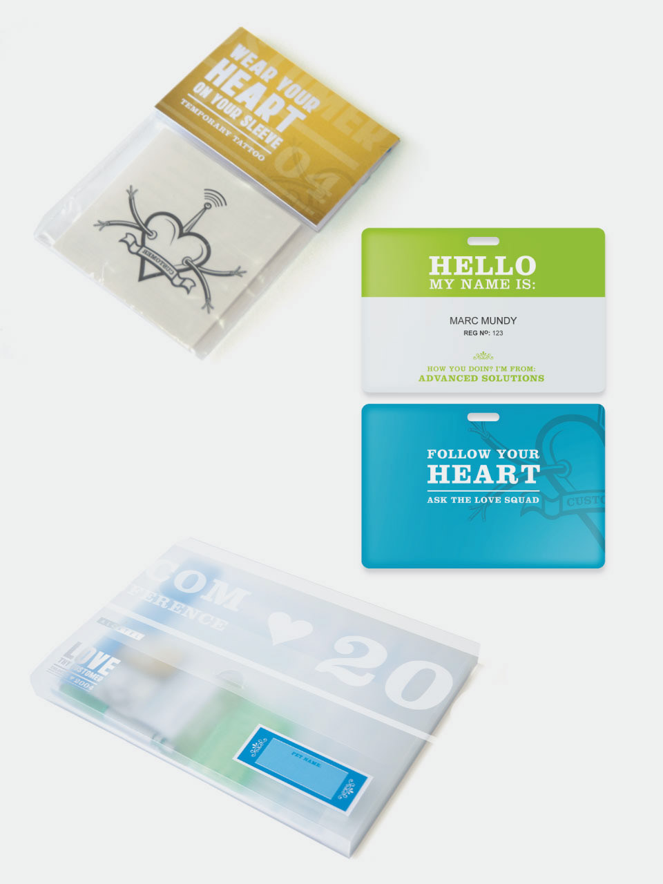
The concept for the sales conference was built around Telecoms' key strategic objective to make the customer the primary focus. We needed to communicate that being a leading Communications Service Provider comes from a deep understanding of the customers and their needs. This involved communicating putting customers first, understanding customers’ needs and providing solutions to meet these needs. In many ways it is like being in a relationship.

Above work — clients of & designed at: Switch
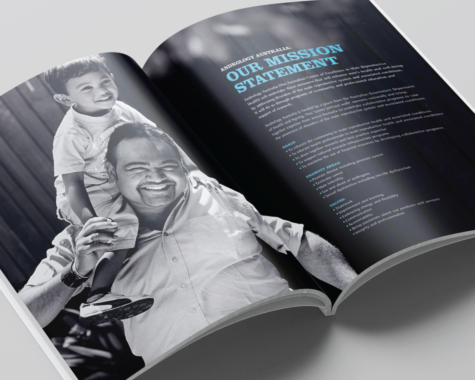
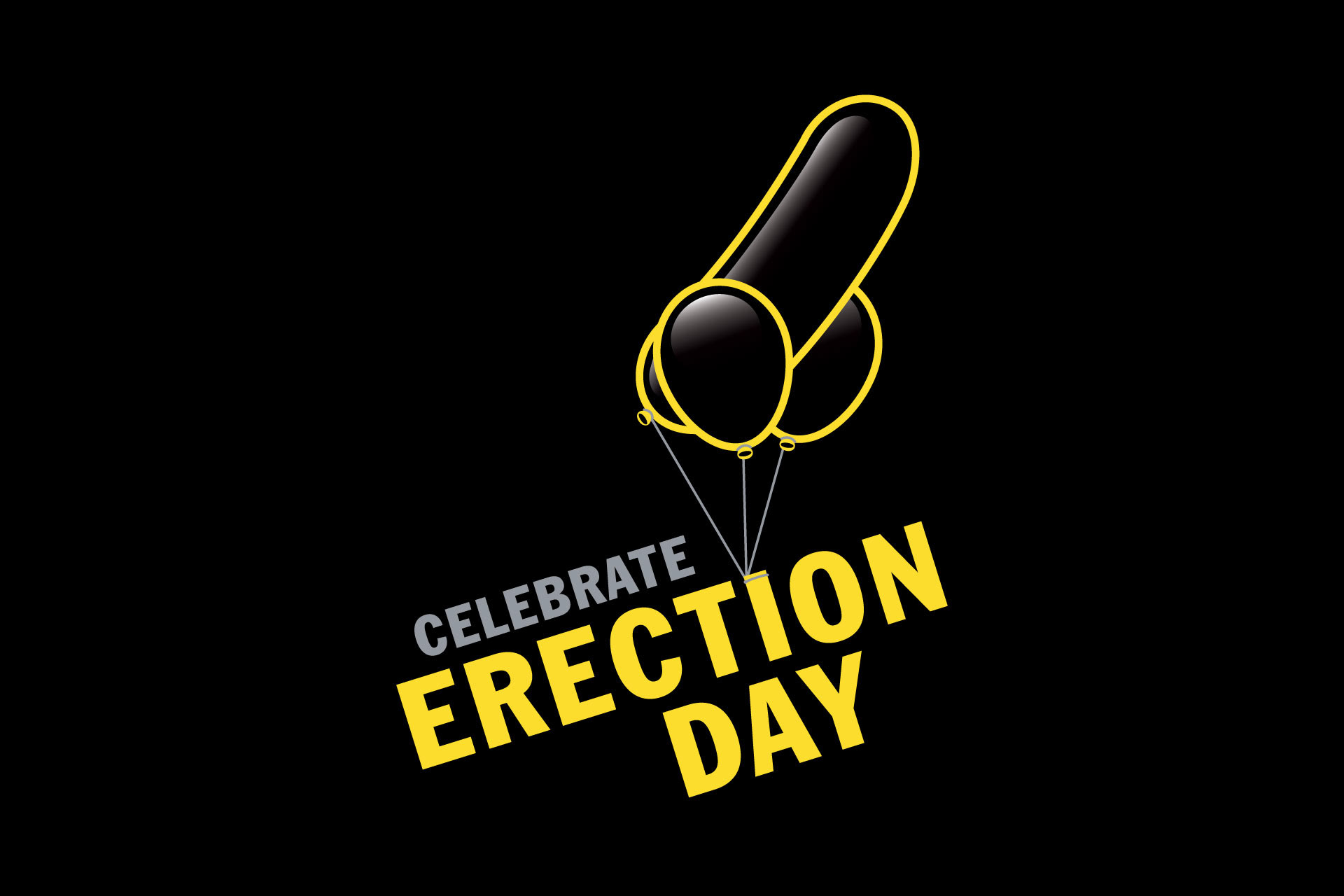
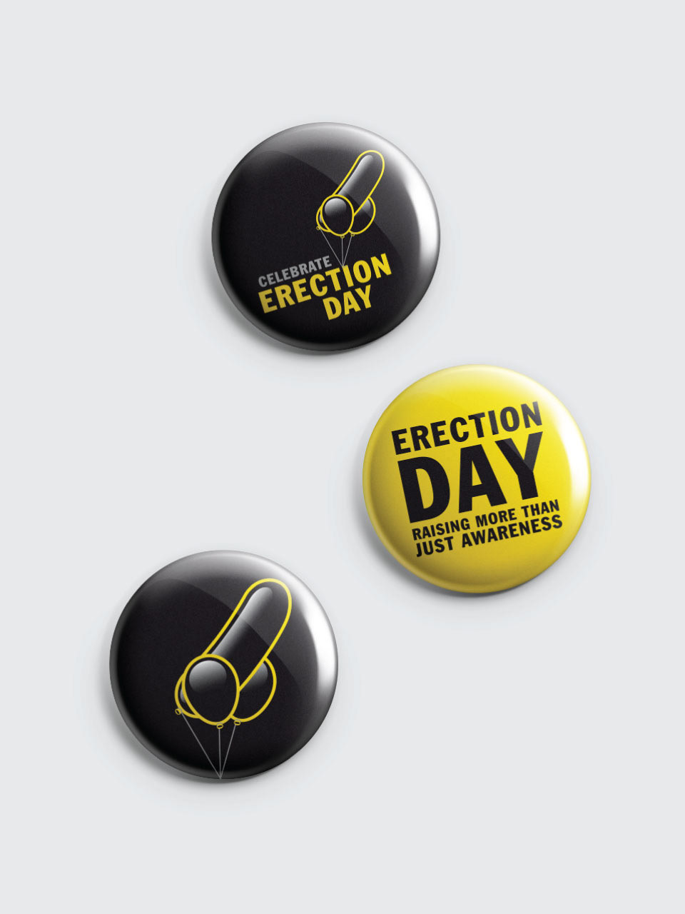
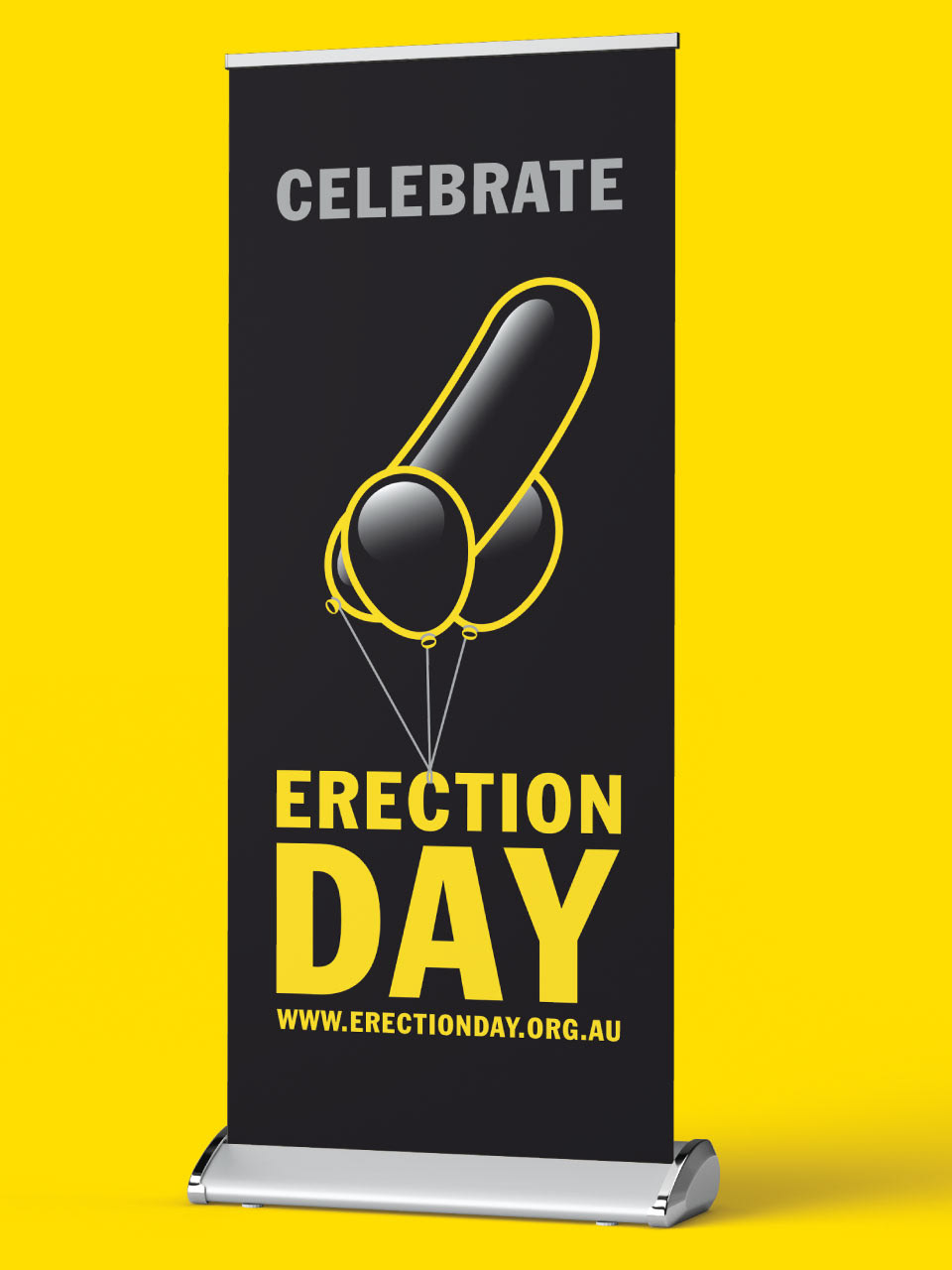
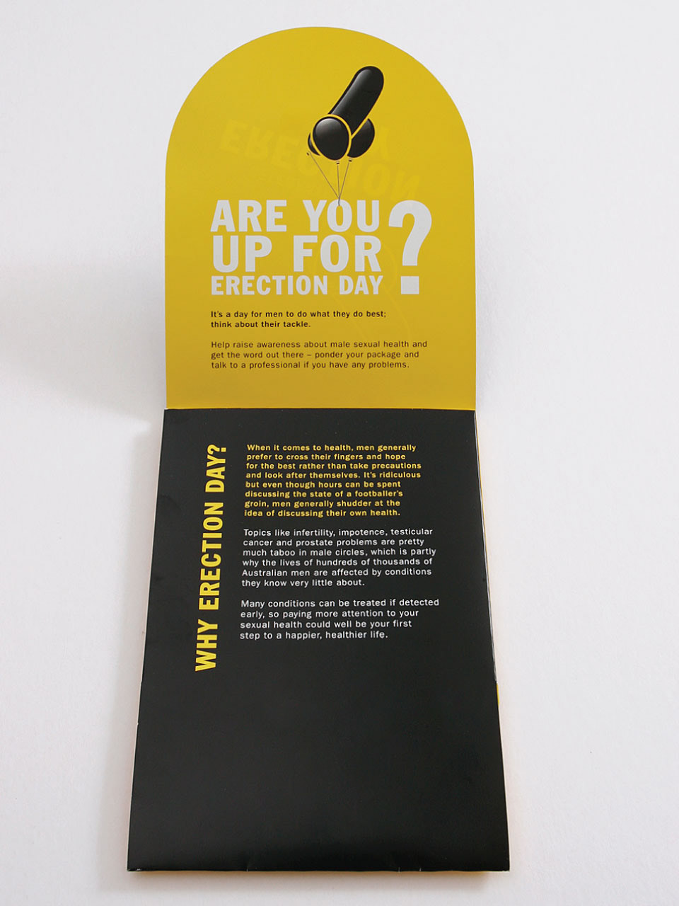
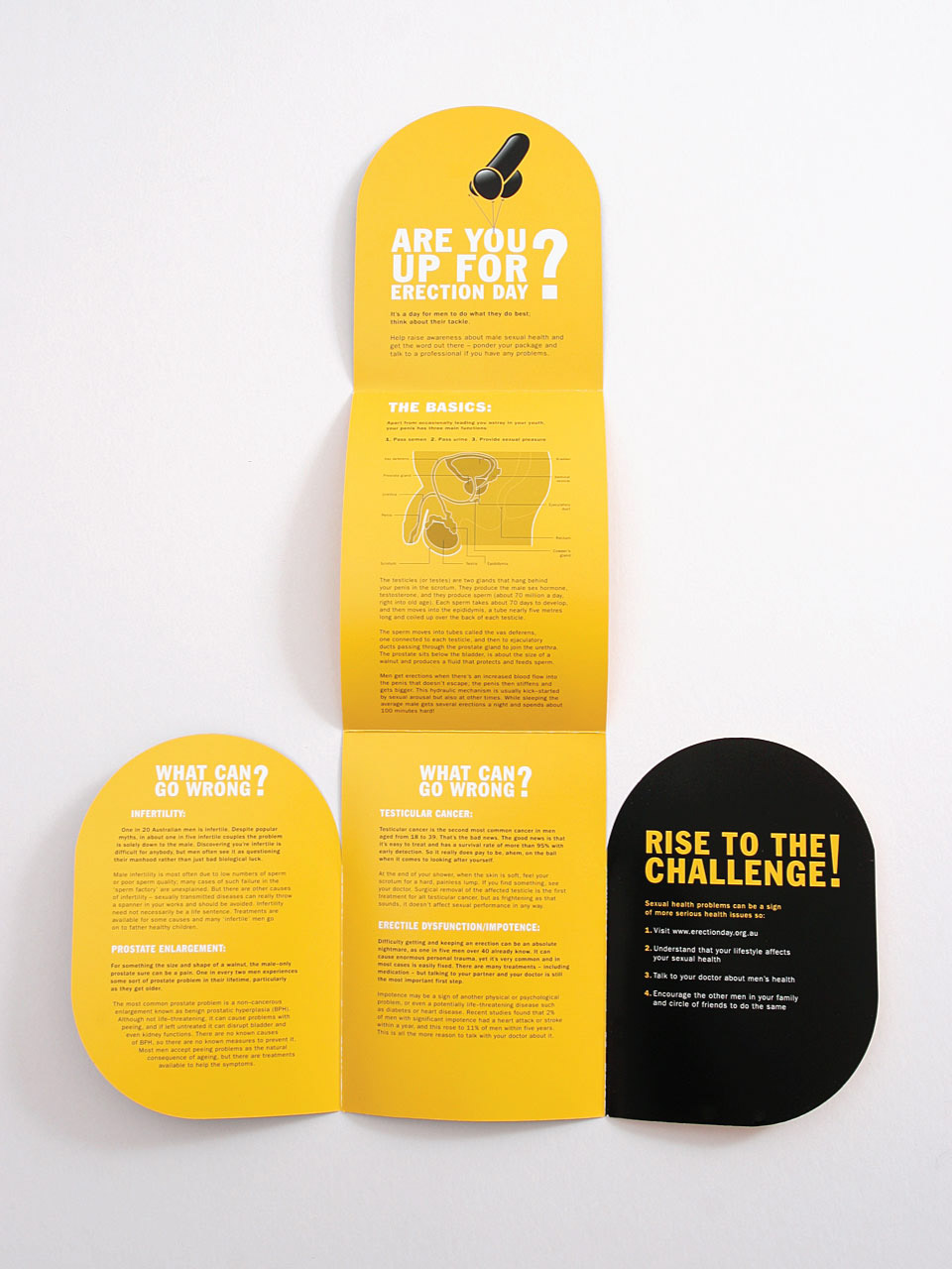
Erection Day— Andrology Australia:
Andrology Australia are an organisation that aims to raise awareness about male reproductive health issues and provide medical professionals with quality male sexual health information. Erection Day is a fun way to get men to do what they do best; think about their tackle. The initiative was used to help raise awareness about male sexual health and get the word out there about topics like infertility, impotence, testicular cancer and prostate problems and get men to talk to a health professional.
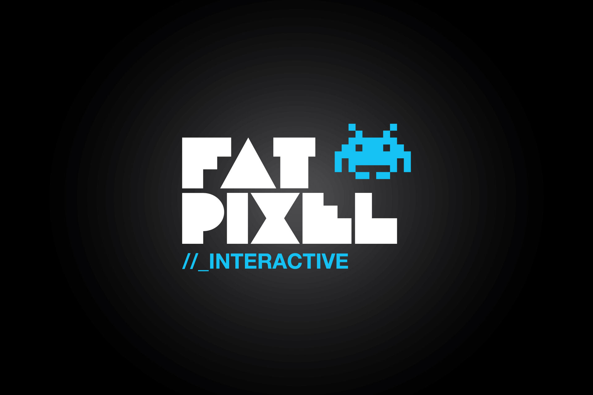
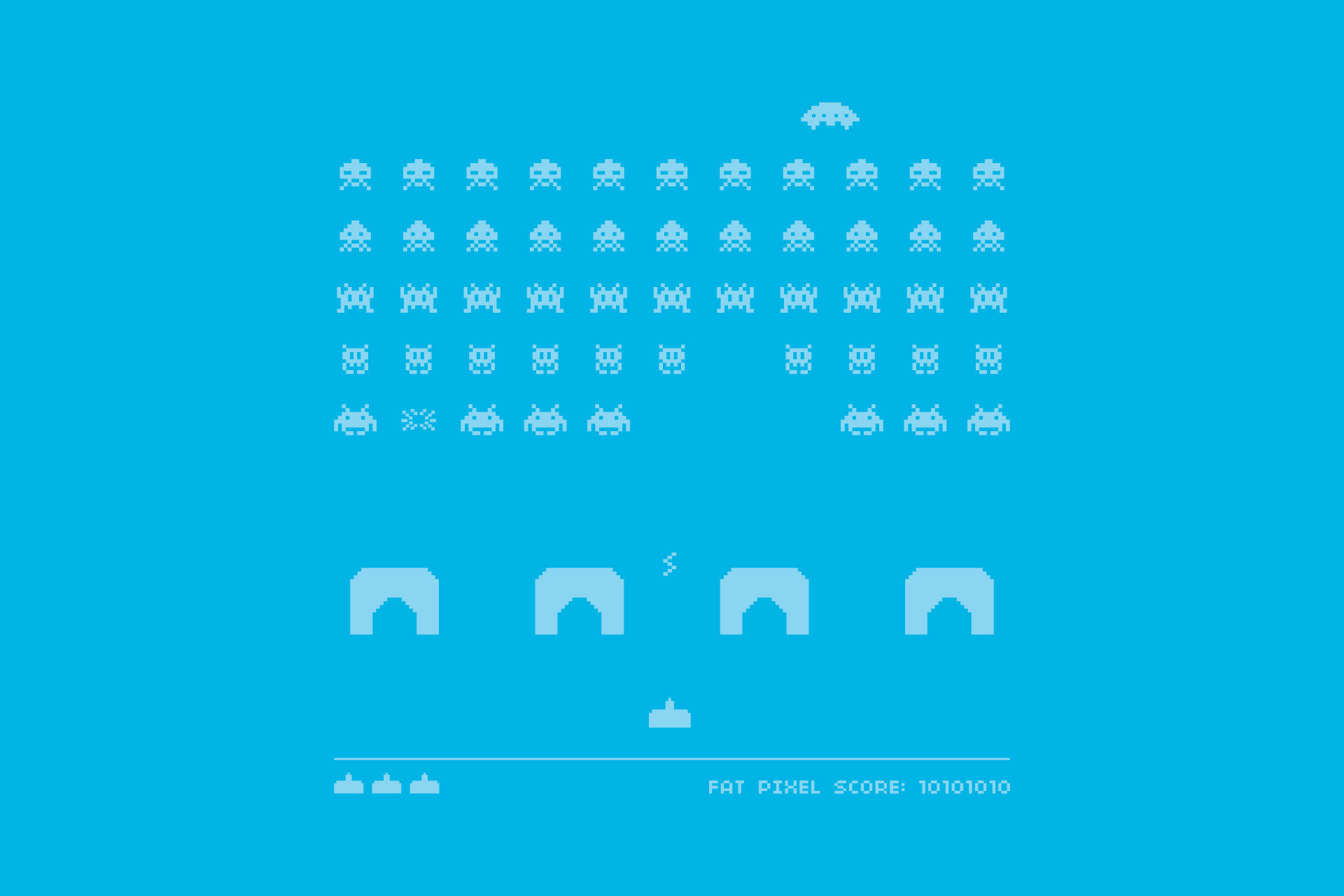
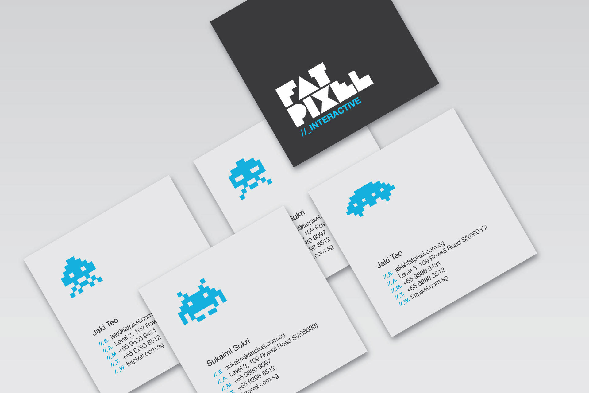
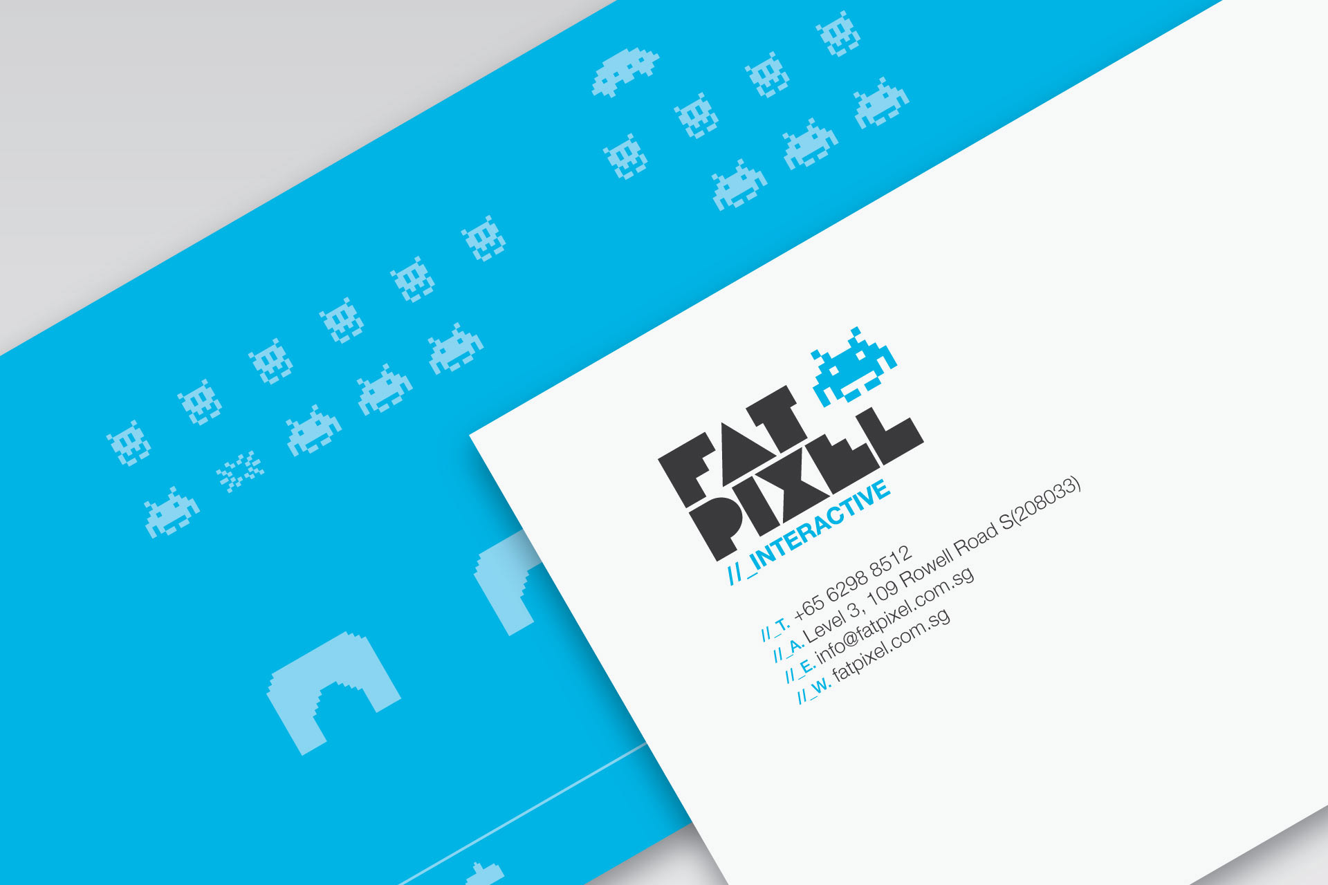
Fat Pixel Interactive— Corporate Identity:
Fat Pixel is a digital media studio based in Singapore specialising in online communications. The brief was to create a fun, cool identity that reflects the owner’s personalities, youth and lifestyle. The concept for the identity was to create a visual link to the name - Fat Pixel. The chunky little pixelated characters are drawn from a pioneer video game - Space Invaders and express the fun and personality of this young company. The different characters are used in various ways across the identities applications.
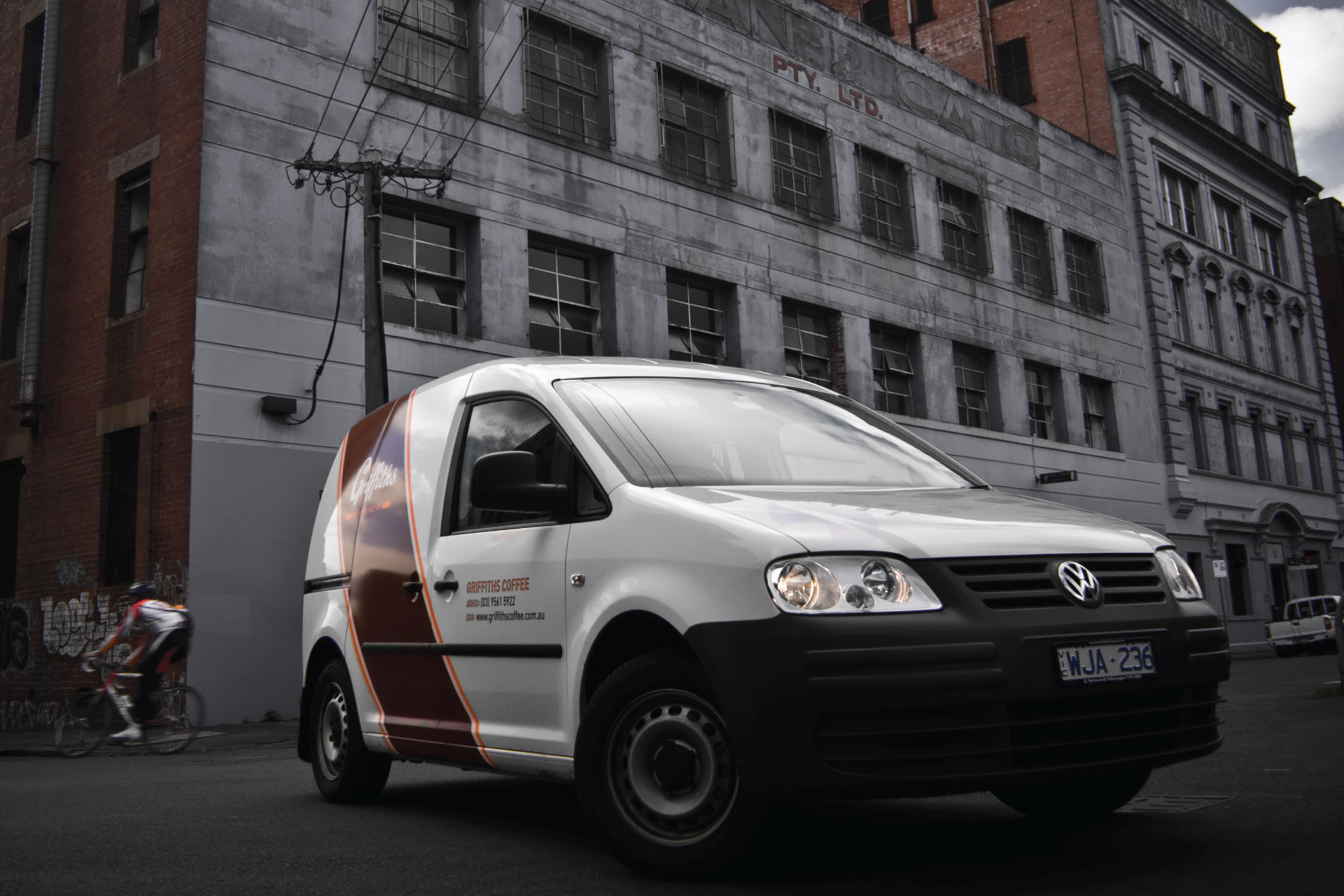
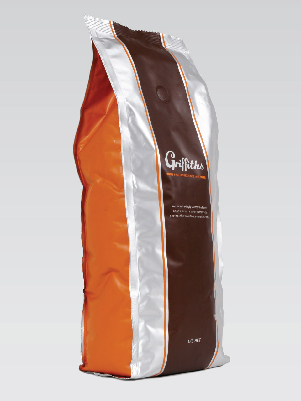
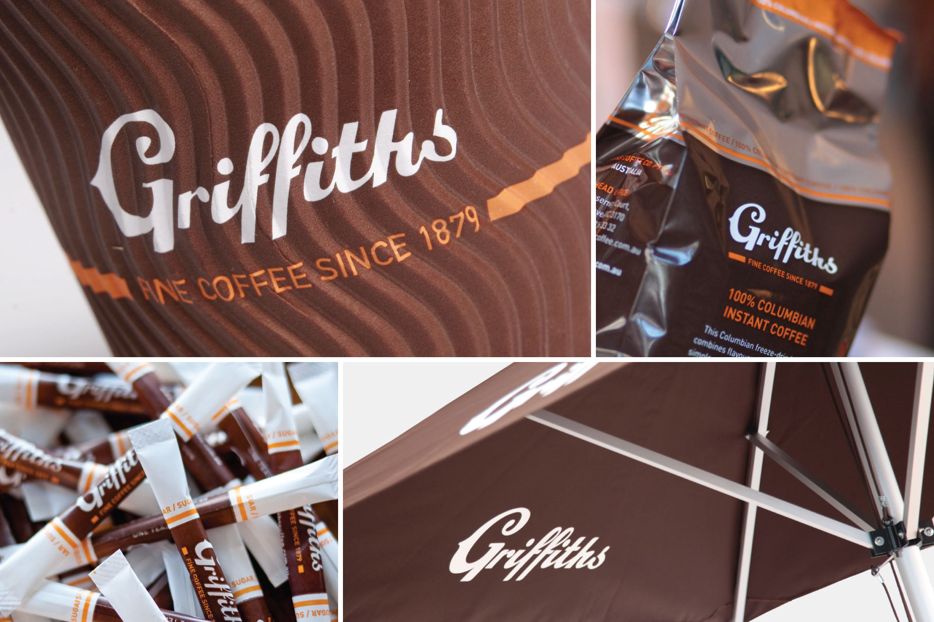
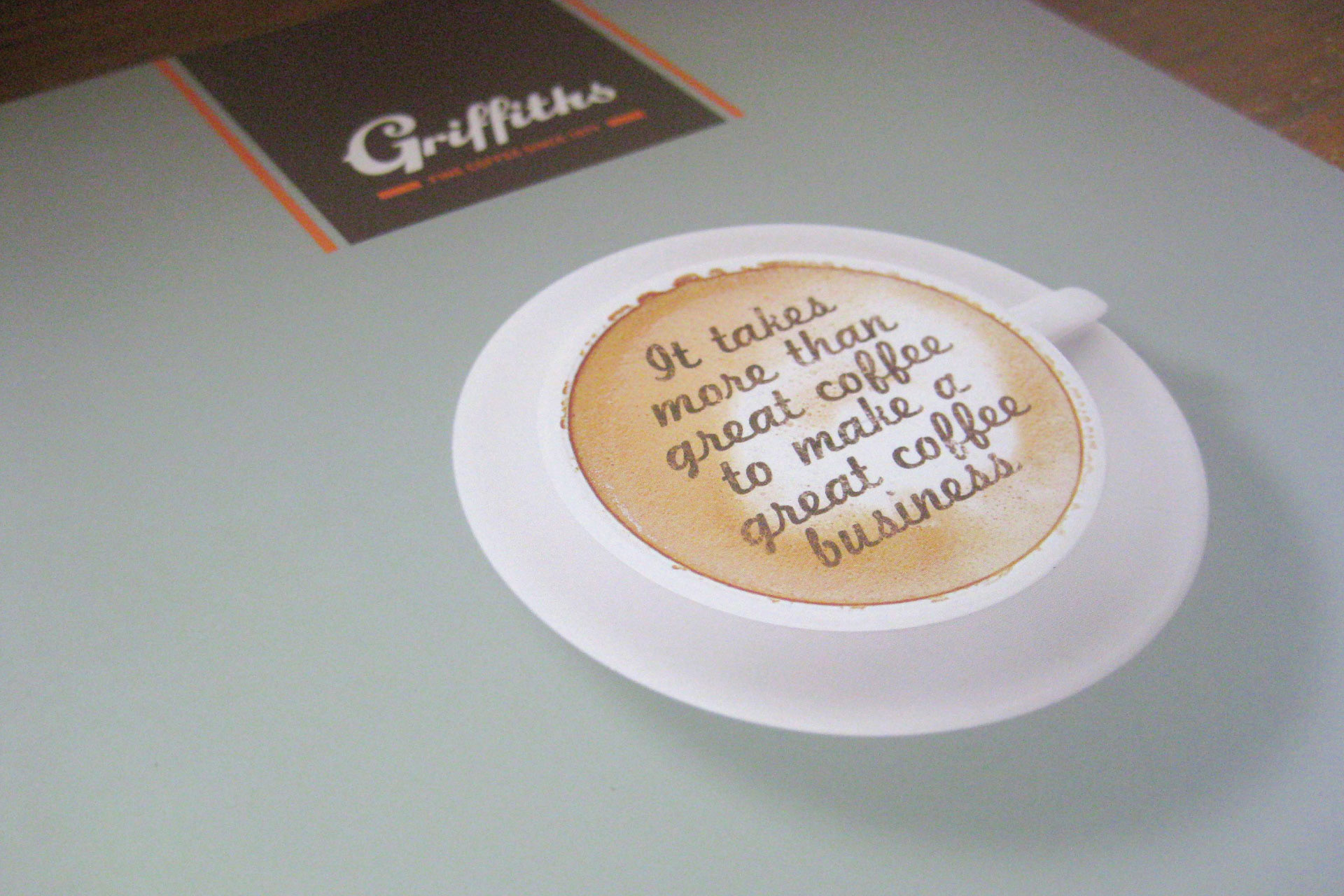
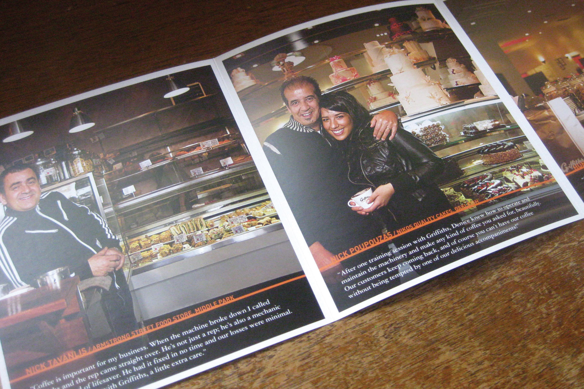
Griffiths Coffee— Rebranding & Collateral:
Griffiths is Australia’s oldest coffee maker. The goal was to maintain their history while refreshing the brand. The result is a dynamic contemporary mark filled with traditional coffee values. The new brand was applied to everything from single-serve sugar packs to delivery vans, and naturally, coffee packaging.
Above work — clients of & designed at: Sense Advertising
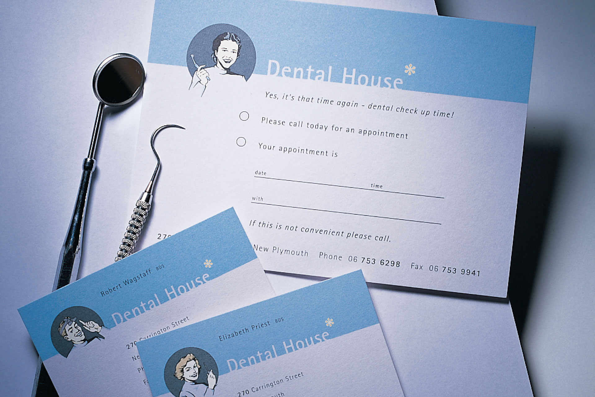
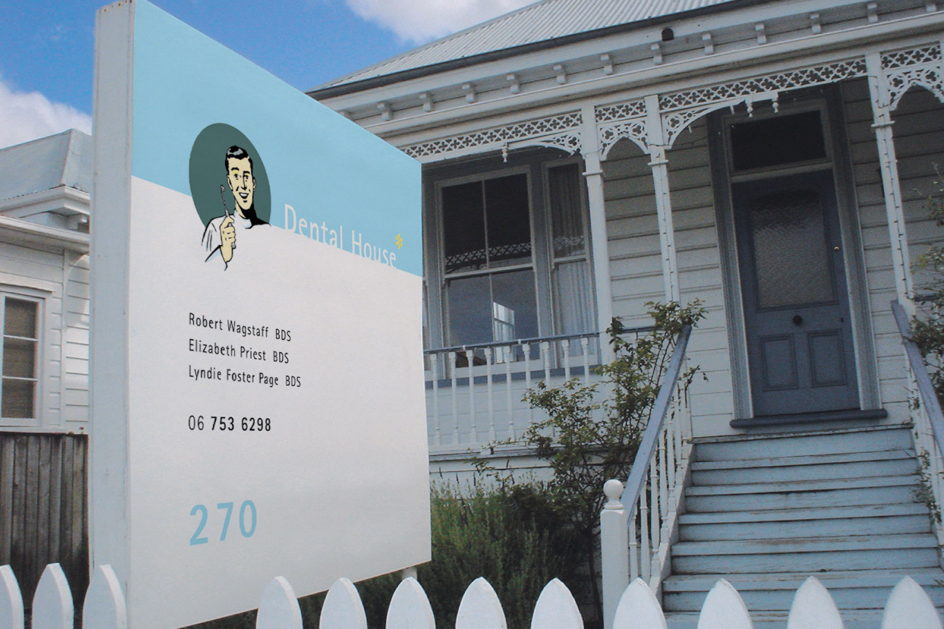
Dental House — Dental Practice Identity:
As the surgery is based in a renovated residential bungalow; the name ‘Dental House’; was drawn from the character of the site. The concept borrowed tradition dental colours those being the baby blue and the pastel yellow. The concept was to use 1950's imagery dentists holding dental tools - the use of the illustrations are meant to be very much ‘tongue in cheek’ and light hearted. The goal was to enforce the traditional values in a distinctive and memorable way while creating a feeling of comfort and confidence in the Surgeons.

Above work — client of & designed at: GardyneHolt
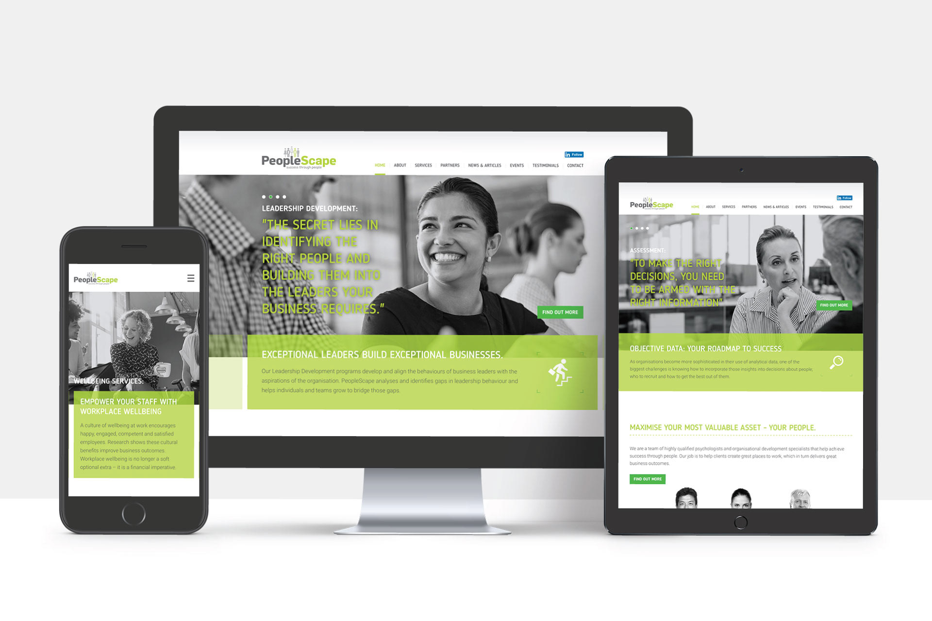
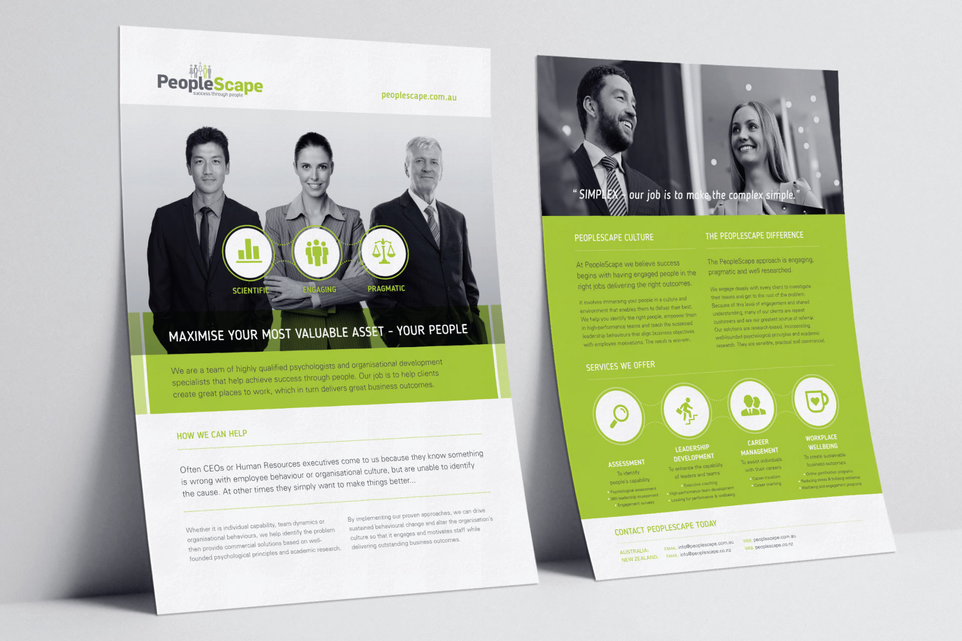
PeopleScape — Website & printed collateral: